
Branding for Contractors
Contractor branding a homeowner remembers
You do careful work. The homeowner choosing between you and two other trucks has not seen any of it yet. She has seen a name, a mark on a door, a shirt at her threshold and a sign in a neighbor’s yard, and she is making up her mind from those four things.
Legacy Sales Engineering builds brand identity for contractors and home service businesses: naming and rebrands, logo and mark, a color and type system, truck and uniform application, yard signs, and the rollout into your website and ads. Founder Shawn Derrick brings 25 years in sales. The work starts with a free brand evaluation and ends with files you own.
What does contractor branding actually cover?
Branding is not a logo. The logo is one piece of it, and on its own it will not move a homeowner an inch. What you are buying is a set of decisions, made once and written down, so every place your company shows up says the same thing. The name and what it promises. The mark, plus the stripped down version that still reads at three inches on a hat. The two or three colors you own. The typefaces on your estimates and your shirts.
Most contractors arrive with pieces instead of a system. A logo drawn by somebody’s nephew in 2014. A truck lettered by whichever shop was cheapest that year. Shirts in a green that appears nowhere else. A website where a third party picked their own blue. None of those is a disaster by itself. Stacked together they read as four different companies, and the homeowner who saw you Tuesday never connects you to the sign she passes on Thursday.

Why do so many contractor brands look the same?
Because most of them were assembled off the same short menu. A house silhouette. A swoosh. A flame or a droplet depending on the trade. Bold blue with a red accent. A name built from a first name plus the service, which is how one market ends up with three companies whose trucks are indistinguishable at a stoplight. Nobody chose that. It is what happens when every piece gets decided separately, by a different vendor, with nothing written down between them.
A brand worth paying for does the opposite. It picks a lane and commits: a mark that is recognizable in one color at small size, a palette narrow enough that people learn it, one display face and one text face, and a name that is not fighting the two companies listed above it. Here is what that looks like once it is written down. This one is ours.
Primary fill
Primary text tint
Secondary fill
Secondary text tint
Ground
Two fills, two text tints, one ground. The tints exist because the raw fills fail contrast as body text on a dark background, which is the kind of rule that gets settled once so nobody argues it again on the next flyer.
ABCDEFGHIJ 0123456789
Condensed, heavy, uppercase. The face that has to hold up on a truck door at thirty five miles an hour.
Estimates, invoices, service agreements, the website and every word a customer reads twice.
Quieter on purpose. A display face set as body copy is why so much contractor paperwork is hard to read, and hard to read reads as unprofessional.
What is in the identity system you receive?
Every project is scoped to what you need, so not every item lands on every job. This is the full menu, in the order it usually gets built.

01Naming and rebrands
If the name is holding you back, we say so, then work the new one out with you. What it has to cover five years from now, whether it survives adding a second trade, and whether it still sounds right when your dispatcher answers the phone.
02Logo and mark
A primary lockup, a horizontal version, a stacked version, and a single color mark small enough for a hat or a favicon without turning to mush.
03Color and type system
Two or three colors with exact values for print, vinyl, thread and screen, plus a display face and a text face, so the sign shop and the shirt shop are not each guessing at your blue.
04Truck and vehicle application
Placement, size and spacing for a door, a tailgate and a full wrap, drawn against your actual vehicles so the shop is not improvising the day it goes on.
05Uniforms and field apparel
Shirt, hat and jacket layouts, embroidery versus print, and the version of the mark that survives a stitch count.
06Yard signs and job site presence
The layout that reads from the street in two seconds: name, trade, phone. Nothing else earns the space. Signs, door hangers and job site boards from the same rules.
07Print and paperwork
Estimates, invoices, business cards and service agreements set in the system, so the paper a homeowner is holding matches the truck in her driveway.
08Guidelines and production files
One document holding the rules, plus production files you own outright, in the formats a printer, an embroiderer and a web developer each ask for.
01Naming and rebrands
If the name is holding you back, we say so, then work the new one out with you. What it has to cover five years from now, whether it survives adding a second trade, and whether it still sounds right when your dispatcher answers the phone.
02Logo and mark
A primary lockup, a horizontal version, a stacked version, and a single color mark small enough for a hat or a favicon without turning to mush.
03Color and type system
Two or three colors with exact values for print, vinyl, thread and screen, plus a display face and a text face, so the sign shop and the shirt shop are not each guessing at your blue.
04Truck and vehicle application
Placement, size and spacing for a door, a tailgate and a full wrap, drawn against your actual vehicles so the shop is not improvising the day it goes on.
05Uniforms and field apparel
Shirt, hat and jacket layouts, embroidery versus print, and the version of the mark that survives a stitch count.
06Yard signs and job site presence
The layout that reads from the street in two seconds: name, trade, phone. Nothing else earns the space. Signs, door hangers and job site boards from the same rules.
07Print and paperwork
Estimates, invoices, business cards and service agreements set in the system, so the paper a homeowner is holding matches the truck in her driveway.
08Guidelines and production files
One document holding the rules, plus production files you own outright, in the formats a printer, an embroiderer and a web developer each ask for.
How does a rebrand work, step by step?
Three steps. You make the decisions, we do the building and the sequencing, and nothing goes to a printer until you have signed off on the version that goes on the truck.
Sit down and get the story straight
We start with a free brand evaluation. What you sell, who buys it, what you want to be known for, and what your name is doing for you or against you. We look at the truck, the shirt, the sign and the estimate, because that is the order a homeowner meets you in.
If your brand is fine and the problem is somewhere else, we say so and point you at the real one.
Build the identity
The name first if it is changing, then the mark, the palette, the type and the applications. You see options, you choose, we refine. Every piece gets tested where it will live: shrunk to hat size, flattened to one color, laid out on a door.
You approve the final versions before anything is ordered, printed or stitched.
Roll it out in order
Cheap and visible first, expensive and slow last. Profiles, listings, paperwork and signage change in days. Uniforms and vehicles get sequenced against your reorder schedule so you are not paying twice to redo a wrap you bought last quarter.
You get the schedule up front.
Where does your brand actually get seen?
Not on a mood board. Your brand gets seen in four places, and every one of them has a physical constraint that decides the design. Skip the constraint and you get artwork that looks great on a laptop and disappears in the field.
- The truck door
Two seconds at thirty five miles an hour
You get about two seconds and maybe twenty feet. One clear shape, a name in a face that holds up condensed, and a phone number sized to be read rather than admired. Fine detail that sings on a screen turns to noise on a moving door.
- The doorstep
The shirt is the closest she gets
A uniform is the nearest a homeowner ever stands to your brand. Embroidery flattens fine detail and thread colors are limited, so the single color mark has to be drawn deliberately instead of exported the week the shirts are ordered.
- The yard sign
The cheapest advertising you own
A sign in a neighbor’s yard is the least expensive advertising a contractor has and the most commonly wasted. Three elements, high contrast, readable from a car doing thirty. If it needs a fourth line, it needs a different sign.
- The estimate
Where the decision gets made
The estimate is the document she reads twice and shows her husband. When it carries the same mark, color and type as the truck in the driveway, the number on it reads like it came from a real company.
What does a full rebrand look like in practice?
Always A Sweep became Always Fire and Gas. Legacy Sales Engineering did the complete rebrand: the new name worked out, then carried across the identity and applied everywhere the old one lived.
A name change is the hardest version of this work. The recognition sitting in the old name has to be carried forward while the new one takes over, and it has to happen in a sequence. Anybody can draw a logo. Changing the name a company has answered the phone with for years, without dropping the customers who only know the old one, takes a plan.
Ask any branding partner what they do about the old name, and listen for whether they have an answer.
Stop Selling. Start Solving.
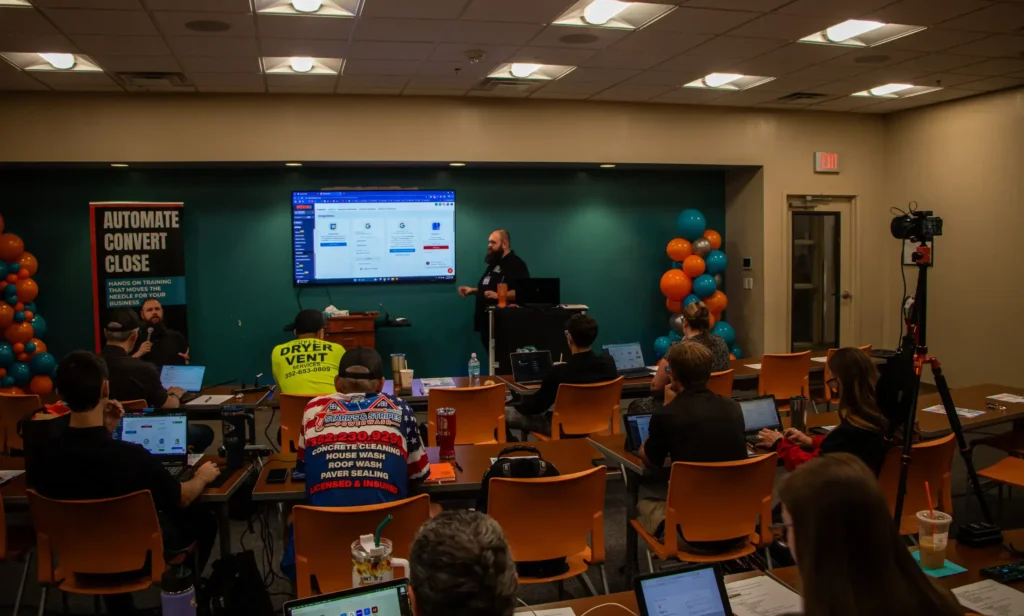
Shawn Derrick, founder of Legacy Sales Engineering, brings 25 years in sales to this work. That is why this page is about what a homeowner does when she sees your truck.
He also runs Legacy Builders Mastermind, a Legacy Sales Engineering program for owners who want to work on the business alongside other people doing the same thing.
What does it cost you to leave the brand alone?
Two things, and neither shows up on a profit and loss statement. The first is a truck nobody remembers. It drove past four hundred people today and not one of them can name it tonight, which means every job still has to be bought with an ad or a discount instead of collected from recognition you already paid for. You are running the billboard either way. The only question is whether it works.
The second is a name that sounds like three competitors. When a homeowner half remembers you and searches the words she thinks she saw on the door, she lands on somebody else with a similar name and a similar blue truck. You never find out. It shows up as a quiet month.
The after is quieter than the pitch usually suggests. A homeowner opens the door, sees the shirt, and recognizes it from the sign two streets over. Your crew looks like one company instead of five guys who happened to arrive together. The estimate matches the truck. You stop half apologizing when you hand somebody a card.
And if the honest read is that you do not need this yet, we will tell you. A contractor with three good reviews and nobody answering the phone needs the phone answered, not a new logo.

How does the brand carry into your website and ads?
This is where most branding projects quietly fall apart. The files get delivered, the truck gets lettered, and then the website keeps its old blue and the ads keep running an old mark, because nobody owned the sequence after the artwork was handed over. We build the identity with the digital application already in mind, then apply it. Your website gets the real palette and the real typefaces. Your ad creative uses the approved mark at the sizes each platform actually serves. Your social profiles get correct crops instead of a squashed banner.
It carries into the places people search, too. Your Google Business Profile logo and cover image, your directory listings and the messages that ask customers for reviews all get the current identity, so the company a homeowner finds online is recognizably the one that pulls into her driveway. That consistency does not hold by itself. Somebody has to keep applying it every time a new flyer or a new truck shows up.
If you would rather that be handled continuously than as a one time project, that is what The Full Stack covers. It runs $4,995 a month on a twelve month agreement that renews for a further twelve months, we take on two new clients a month, and there is usually a waitlist. If you only need the identity built and you have somebody to carry it, we will do that instead and say so plainly. The rest of what we do is on the services page.
Branding questions contractors actually ask
How long does a rebrand take?
It depends on how much is changing. A mark and color refresh moves faster than a full name change, because a new name has to be sequenced across vehicles, signage, paperwork, listings and the website rather than swapped over in an afternoon. You get a schedule at the start saying which pieces change immediately and which wait for the next reorder.
What happens to our old name?
It gets carried, not deleted. Customers who only know the old name still have to find you, so it stays visible through the transition in the places people look for it, and your listings and profiles get updated rather than abandoned. That is how the change from Always A Sweep to Always Fire and Gas was handled.
Do we have to give up our existing logo?
No. Plenty of contractors have a mark with real recognition behind it that simply needs cleaning up: better proportions, a workable single color version, and files a printer can actually open. We tell you honestly which situation you are in. If your logo is worth keeping, keeping it protects the recognition you already built.
What files do we receive?
Production files you own outright, in the formats each vendor asks for: vector artwork for sign shops and printers, a single color version ready for embroidery, and web sized files for your site, ads and profiles. You also get a written guidelines document with the color values, typefaces, spacing rules and approved lockups.
Does a rebrand change our Google listing?
Yes, and it has to be done deliberately. The business name, logo and cover image on your Google Business Profile all get updated, and Google may ask you to verify the business again when the name changes, which is normal. We keep the name, address and phone consistent everywhere else so your search presence does not split in two.
Does branding include the website?
The identity work and the website build are separate pieces, and they are usually done together because the site is where most people meet the brand. If you already have a site, we apply the new identity to it. If the site needs rebuilding, that is our website development work and it gets quoted alongside the branding.
Ready to look like the company you already are?
Start with a free brand evaluation. We will look at your name, your mark, your truck, your shirts and your paperwork, and tell you plainly which of them is costing you work and which is fine as it stands. No charge for that conversation and no obligation after it. If the answer is three hours with a sign shop and not a rebrand, that is what you will hear.
Or call (352) 612-3327 and talk it through. We answer Monday through Saturday, 9am to 8pm, and you can reach us at service@liftinglegacies.com. Not ready to talk yet? Read how the identity work connects to everything else on The Full Stack.
Legacy Sales Engineering is the trade name of Derrick Ventures LLC, founded by Shawn Derrick, serving contractors and home service businesses. Stop Selling. Start Solving.
Related: all services · website development · ad management · social media · the full stack · about · contact